Week 4 - Bernardo Pinto
With the addition of two additional members to our team, we are now a team of 4 game designers/developers (that’s us!), 2 artists and 2 game writers. The pair of writers joined the team, and had some questions for us, as it was normal. What wasn’t normal though, was our inability to properly answer them. We all had some ideas in our mind, mostly aligned, of what the game would/could be, but not much was written on paper.
Thus, we decided to create an internal document, focusing on answering a lot of the conceptualization questions, while also deciding on a baseline setting for art and story, so all members can work on something more concrete.
Regarding prototyping, we first talked together as team to discuss potential player experience problems in our game. In our opinion, it is very important to know how the player interacts and understands what is going on during the battle, so it’s crucial to prototype how much information will be shown and how.
To that end, I prototyped the game UI during battle, to answer questions that could be condensed into this one: How does a player interact with the game during a battle?
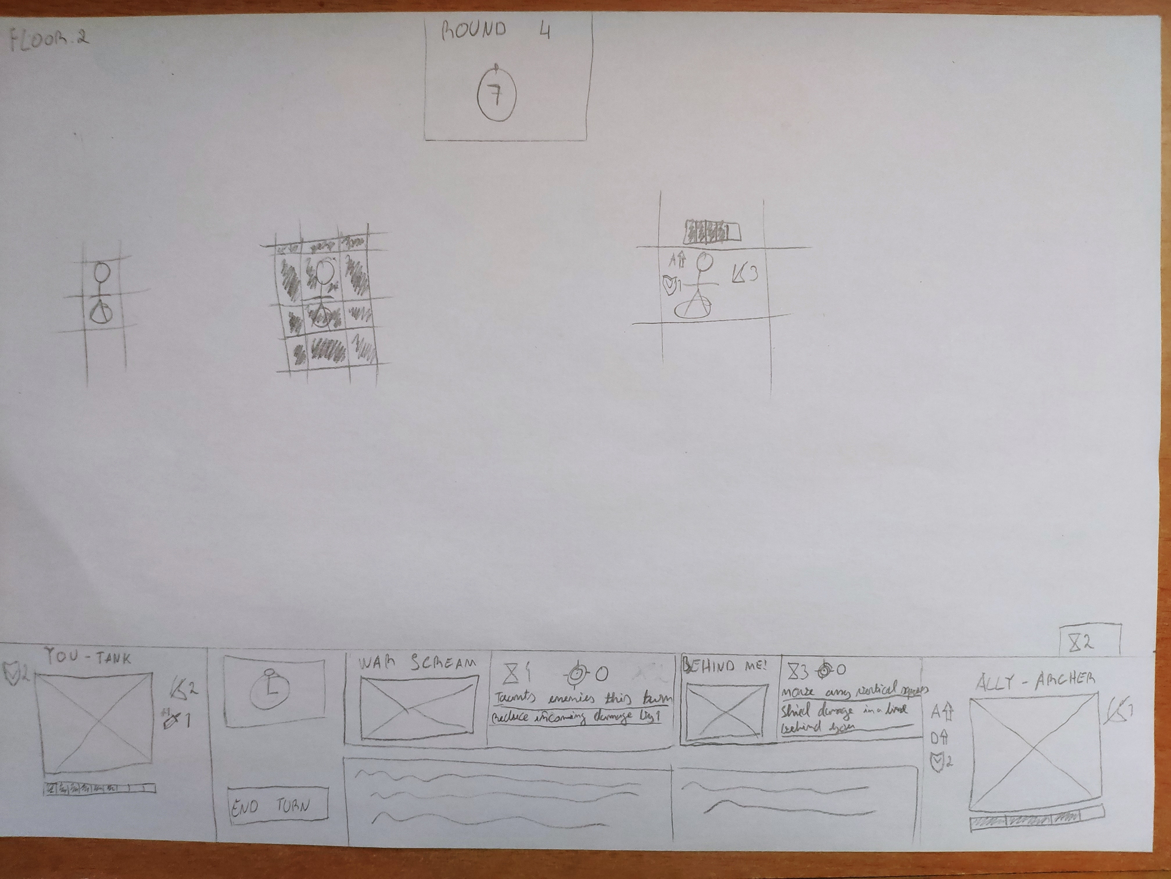
First Iteration - Paper Sketch
Fast and easy to create, a good choice to get an overall idea of where major elements will be.
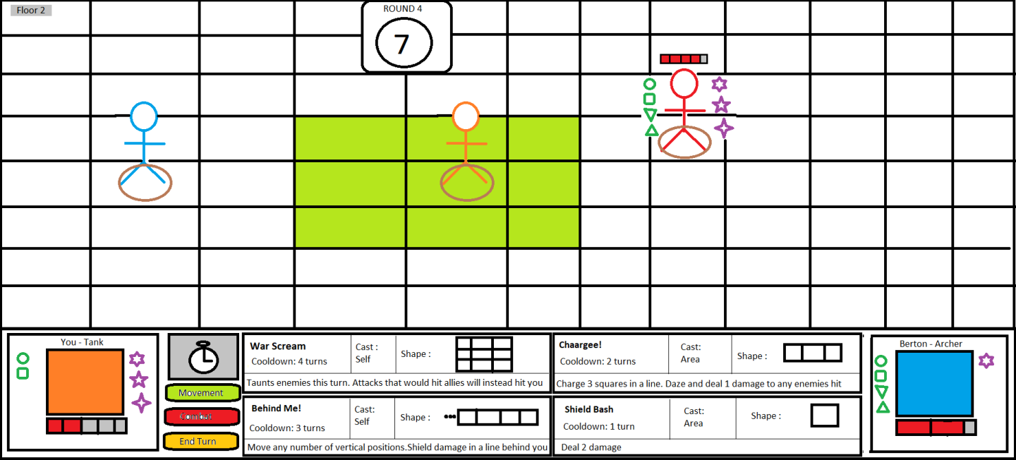
Second Iteration – Paint
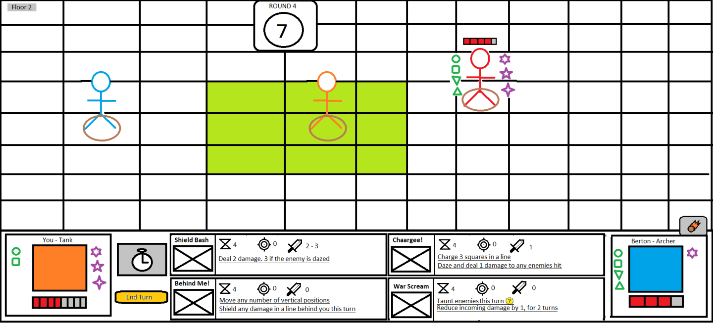
Although a paper is relatively fast and easy to create, the same cannot be said to modifications. Because of that, I opted to do it in a more digital format. Regrettably, I chose paint. I regret using paint because creating was hard and slow. Thankfully, modifying it is not hard.
It’s worth noting, I did not follow the paper prototype a lot here. I wanted to try something things, such as combat and movement buttons, and shapes of the abilities.
This version was not tested with users. It was mainly done to understand internally if it made sense to have combat and movement buttons, and shapes of the abilities, as well as a different layout of the ability’s description.
Third Iteration – Paint
We decided that the changes the second iteration introduced made it worse, and so I reverted them.
Having information such as shapes is useless since the user can see it on the grid when clicking the ability and will also learn it. Movement and combat buttons are not needed too: To select a move, the user can click his own character – something which all the users were able to understand very fast. And the combat button can be skipped by choosing an ability.
Fourth Iteration – Moqups.com
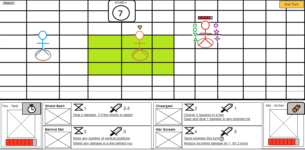
I found this app which is honestly great to work with. It was easy to make, allows organization, and easy modification. The key selling point for me was that it can achieve high functionality if needed. For example, the “?” icon after an ability description shows some text when hovered. Sadly, you need to upgrade your plan if you want to export it. Oh well.
Either way, more changes with user feedback:
- Range icon removed. The player can learn from experience and can see it on the board.
- Special abilities were moved to the right top corner of the character information.
- End turn button moved to the top right corner.
- A marker symbolizing whose action plays first was added on top of the character (that goes first).
Fifth Iteration – Moqups.com
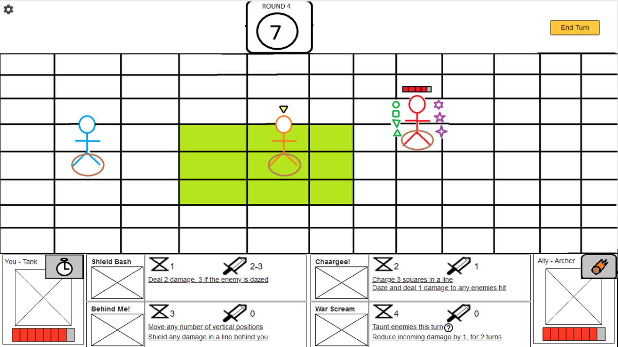
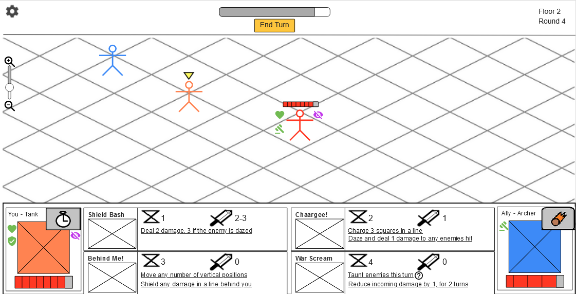
Some users and members of the team were not a fan of information in the grid being blocked, so I tried a new prototype: The grid takes a little less space, but it's clear from obstructions now. A menu button was also added, which opens some space for new information, such as whose action plays first, instead of using a marker.
Sixth (and final) Iteration – Moqups.com
Our artists want to draw in an isometric point of view, and we don’t mind it at all. To check if the users prefer this view, I changed the prototype to have an isometric grid.
The round and timer information were also occupying too much space, so the timer was replaced with a progress bar, with the end turn button below it, making it clear what it means. The floor and round information were packed together on the upper right corner.
There are still a few things I would like to experiment, such as removing all text from abilities, and have instead a “?” symbol, that shows information about the ability when hovered. But I have to stop iterating somewhere, or this would go on forever, and I’m content with the final prototype.
Get Deuce's Tower
Deuce's Tower
MDJ Project 2021
| Status | Prototype |
| Authors | David Pereira, Bernardo Pinto, DanielVC, TigoDelgado |
| Genre | Strategy |
| Tags | 2D, Co-op, Turn-based |
| Languages | English |
More posts
- Week 13 - Bernardo PintoJun 04, 2021
- Week 13 - Daniel CorreiaJun 04, 2021
- Week 13 - David Pereira - MoJo and PlaytestingJun 04, 2021
- Week 12 - Tiago DelgadoMay 28, 2021
- Week 12 - Bernardo PintoMay 28, 2021
- Week 12 - Daniel CorreiaMay 28, 2021
- Week 12 - David Pereira - MoJo PreparationMay 28, 2021
- Week 11 - Tiago DelgadoMay 21, 2021
- Week 11 - Daniel CorreiaMay 21, 2021
- Week 11 - Bernardo PintoMay 21, 2021
Leave a comment
Log in with itch.io to leave a comment.